

Implementing a new feature to Venmo that allows users to create Recurring Payments
TIMELINE: 4 weeks
ROLE: Research Lead, UX/UI Designer
UNDERSTANDING THE PRODUCT
Venmo is a leading peer-to-peer payment mobile service with approximately 60 million users. Originally created to settle a debt between friends, Venmo is most commonly used for fast and convenient payments through friends, family, coworkers, and small businesses within the United States.
THE PROBLEM
We want to know how people utilize Venmo so that we understand how to better enhance their experience. Venmo’s main goal is to streamline the payment process and to gain and retain users on their mobile app.
THE SOLUTION
Venmo users need a more effective way to make recurring payments.
01. Empathize
OBJECTIVES
Understand what type of transactions people use Venmo for.
Understand how frequently people use Venmo.
Evaluate the importance of ease of use to a person’s Venmo experience.
RESEARCH METHODS
Competitive Analysis
User Interviews
COMPETITIVE ANALYSIS
This research method was utilized to discover and compare existing services that people use for peer-to-peer payments. We researched 3 competing services and gathered insights into what people prefer to use for any given payment transaction.
A key takeaway is that these competing services have a recurring payment feature while Venmo does not.
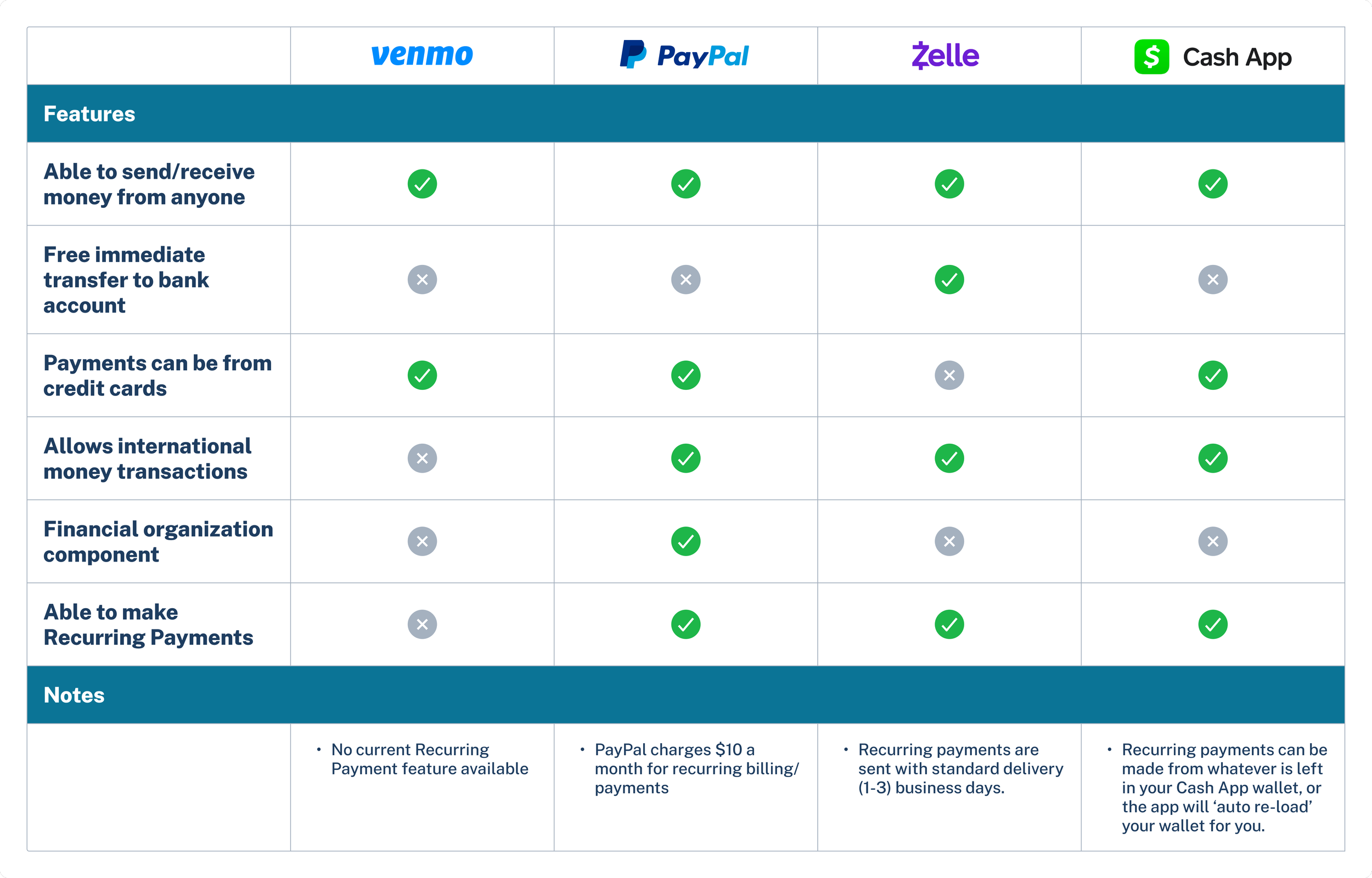
A Competitive Analysis table was created to identify the features, pros, and cons included in each service. Take a deeper look into the Competitive Analysis here.
USER INTERVIEWS
We interviewed 2 people in person and 3 people over Zoom that use Venmo frequently.
A few of the Interview Questions include:
How often do you use Venmo? Tell me about the last time you used it.
What reasons do you typically use Venmo for?
Tell me about your favorite and least favorite part about using Venmo.
An Affinity Map was created to organize the interview findings and identify any patterns amongst the responses. Take a look into the Affinity Map here.
KEY TAKEAWAYS

People most commonly use Venmo for splitting rent/utilities with roommates, restaurant bills, and family subscription services.

People choose to use Venmo because it is the most popular P2P payment service used between their friends and family.

People rely on their memory to remember to charge/pay repeat payments.
02. Define
USER PERSONA
We developed two user personas to anchor the future ideation phase and guide my design process.
Adam is a young, recent graduate that wants to streamline his monthly Venmo usage.
After re-evaluating the idea, Adam became the main persona the new feature is intended and designed for.
Take a deeper look into the two user personas here.
03. Ideate
SITE MAP
The existing site map of the Venmo app was laid out to better understand how to integrate the new proposed feature of Adding a Recurring Payment. Maintaining the organization and intuitive nature of the existing app is crucial to a successful experience. The proposed new mobile screens are shown in green below.
USER FLOWS & TASK FLOWS
After the site map was finalized, 2 User Flows and Task Flows were developed. We chose to focus on the user journeys of Adding a new Recurring Payment and Editing an existing Recurring Payment.
User and Task flows were created to understand the functionality of the site. Take a deeper look into the User and Task flows here.
LOW-FIDELITY WIREFRAMES
Defining the site map, task flows, and user flows helped develop the initial iterations of the low-fidelity wireframes. To incorporate the new feature of setting up a Recurring Payment, the low-fidelity wireframes below illustrate several new screens that would either be updated or added to the existing Venmo interface.
04. Prototype
In preparation to begin the prototyping process, we studied and incorporated Venmo’s existing brand colors, logo, iconography, and images to create high-fidelity wireframes for the two flows below:
Task Flow 1: Adding a new Recurring Payment
Task Flow 2: Editing an existing Recurring Payment

HIGH-FIDELITY WIREFRAMES
USABILITY TEST FINDINGS
We recruited 5 people to participate in the Usability Tests and utilized Zoom’s screen-share capability to conduct and record the sessions. While observing, we also gathered notes and categorized them into what worked, what needs to be changed, potential new ideas, and remaining questions. These usability test takeaways led to a list of priority revisions to be made. Take a closer look at my analysis in the file here.
PRIORITY REVISIONS

Onboarding Message
The usability test participants that did not read the Onboarding Message had difficulty navigating the new feature flow.
To help urge the user to read and fully understand the Recurring Payment process, we chose to refine the onboarding message to be more eye-catching, bold, and condensed the text to be more easily understood.

Recurring Payment Set-Up
To create clarity on when the Recurring Payment would take place, the wording of the CTA and selection fields were updated to alleviate any hesitation or uncertainty.

Reminders
Users want to be aware of when scheduled payments will be processed.
Both pop-up notifications and status updates that stay on the user’s profile will serve as reminders on when previously schedule payments will take place. This will also urge the user to make any changes prior to the processing date, if required.
TEST OUT MY PROTOTYPE
05. Next Steps
REFLECTION
Over the 4 weeks, we were able to analyze an existing mobile app and conduct research that would allow us to propose a new feature that would enhance its’ user experience. Even though Venmo is a popular, successful, and highly-rated app, we learned that there is always something that can be added or changed to streamline its original purpose.
Here are a few things we learned:
Let the research define the solution.
In the beginning stages, we explored a variety of potential features to add to Venmo. However, after conducting competitive research and user interviews, we were able to pinpoint specific challenges current Venmo users experience, and then use that knowledge to define a solution.
Designing within an existing brand interface is both a challenge and an opportunity for growth.
The Venmo interface is thoroughly built out and identifiable, and our challenge was to create a new feature that would seamlessly integrate with the existing app. We researched and gathered resources that broke down the UI interface, and used it as a guideline to develop our proposed screens.
Simplify the user process and iterate as much as you can.
Researching existing recurring payment task flows and user testing was an integral part of how we came to the final task flows and screens. After a few iterations, we chose to prioritize simplicity in the final design to create a user-friendly experience.
WHAT’S NEXT?
Retest iterations and edit the prototype as needed
Handoff to developers
Look forward to testing for KPIs such as high task success rate, low user error rate, and a high customer satisfaction score.
After further testing, start iterating on new components such as including an additional confirmation screen for larger payments.
Working with the constraints of adhering to existing branding, as well as staying within a short timeline, we believe that this project brought a new challenge and therefore new skills. We thoroughly enjoyed this experience, and hope that one day Venmo might consider adding this feature to streamline their users’ payment experience.
Thanks for taking the time to join us.